My first shot at Wordpress themes
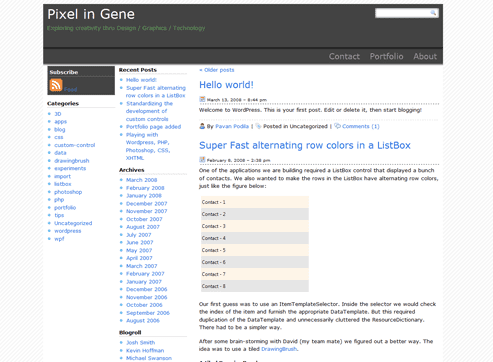
I am sure I am not the only one who would say that Wordpress is a great blogging (+ CMS) platform. There is a vibrant community developing all kinds of stuff with Plugins, Themes and what not! As a fun exercise I decided to create a Wordpress theme for learning more about the platform.
The result is a theme called FlipCard, which you can download here.

Here a few details:
- 3-column, fixed width (1000px)
- 2 sidebars on the left (well suited for blogging, especially with code running to the right)
- Based on the Sandbox theme. The Sandbox theme provides most of files for fetching the data. I only changed the Stylesheet.
- Works in Firefox, IE 7
My workflow
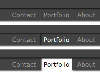
I started by creating a XAMPP Lite environment by following this article. Then I downloaded a copy of Wordpress 2.5 and linked to a backup of my blog database. This was a simple database restore done via phpMyAdmin. The real work started after that. I used Firebug extensively and read lots of stuff on Wordpress Codex. I also looked at lots of CSS design showcases like CSS Zen Garden, CSS Beauty, Best of CSS Design 2007 and a ton of other stuff. Once I had enough background knowledge I decided to make some mock-ups. I used the uber-design-tool: Photoshop, to try out different ideas. The hover animation for the top menu was the most tricky and required some careful pixel-twiddling. BTW, the name FlipCard comes from this hover effect!

Other interesting area was the search bar at the top,

and the admin section at the bottom of the page:


The icons were from the Silk Icon set by FamFamFam.

The stripes for the background of the website was created using the AJAX Stripe Generator.

The end result is of course quite simple-looking but I’ve learnt a lot in the process. And that was the whole idea!
