

Automatic form layouts with the TreeView
Over the past couple of days I have been working on an application that automatically generates a Form layout from an XML file. The XML file represents a form with a bunch of parameters. The form can also contain parameter groups, which can encapsulate a set of parameters. Effectively the XML structure is something like this:
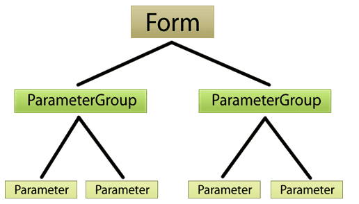
The ParameterGroup has attributes like Collapsible (True, False), Orientation (Horizontal, Vertical). The Parameter can be of different datatypes specified by the Type property. Both the ParameterGroup and Parameter have a Name property.
A TreeView for a form layout
The original XML file had different naming conventions for these elements. I did a simple Linq to XML translation to create an object model with the type names as seen in the figure above. With that said, here is a sample form layout:
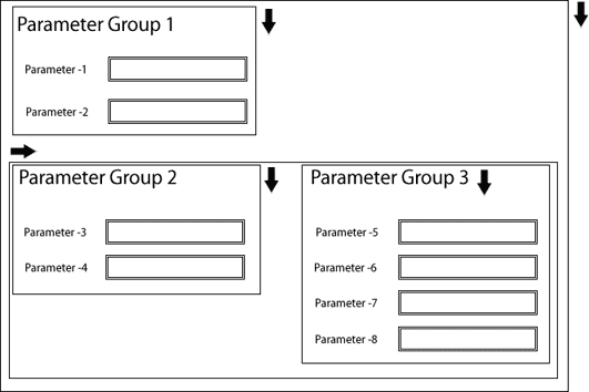
The bold arrows indicate the Orientation of the ParameterGroup. The rectangles are the containers for the groups and for the form itself. From the description so far it should be evident that we are dealing with a hierarchical structure in the form layout. With a little stretch of the mind it is not difficult to imagine that the layout is an instance of a TreeView!
Styling the TreeView to look like a Form
The TreeView is composed of TreeViewItems and HierarchicalDataTemplates. By using specialized ControlTemplates for the TreeViewItem and combining those with the HierarchicalDataTemplates for the ParameterGroup and Parameter, it is possible to make the TreeView look like a form. Josh Smith wrote a good article on CodeProject to give you a head start for styling TreeViews.
Here is my version of the TreeView templates for the form layout.
ControlTemplates
<ResourceDictionary xmlns="http://schemas.microsoft.com/winfx/2006/xaml/presentation"
                    xmlns:x="http://schemas.microsoft.com/winfx/2006/xaml"
                    xmlns:Resources="clr-namespace:Launcher.Resources">

    <Resources:ItemsPanelTemplateConverter x:Key="Conv" />

    <ItemsPanelTemplate x:Key="VerticalLayoutTemplate">
        <StackPanel IsItemsHost="True"
                    Orientation="Vertical" />
    </ItemsPanelTemplate>

    <ItemsPanelTemplate x:Key="HorizontalLayoutTemplate">
        <UniformGrid IsItemsHost="True"
                     Rows="1"
                     Columns="0" />
    </ItemsPanelTemplate>

    <Style x:Key="{x:Type TreeViewItem}"
           TargetType="TreeViewItem">
        <Setter Property="Focusable"
                Value="True" />

        <Setter Property="IsExpanded"
                Value="True" />
        <Setter Property="Template">
            <Setter.Value>
                <ControlTemplate TargetType="TreeViewItem">
                    <Grid>
                        <StackPanel x:Name="PART_Container"
                                    Orientation="Vertical">
                            <ContentPresenter ContentSource="Header" />
                            <ItemsPresenter x:Name="PART_ItemsPresenter" />
                        </StackPanel>
                    </Grid>

                    <ControlTemplate.Triggers>
                        <Trigger Property="HasItems"
                                 Value="False">
                            <Setter Property="Visibility"
                                    TargetName="PART_ItemsPresenter"
                                    Value="Collapsed" />
                        </Trigger>

                        <Trigger Property="HasItems"
                                 Value="True">
                            <Setter Property="Margin"
                                    TargetName="PART_Container"
                                    Value="0,8,0,0" />
                        </Trigger>
                    </ControlTemplate.Triggers>
                </ControlTemplate>
            </Setter.Value>
        </Setter>

        <Style.Triggers>
            <Trigger Property="HasItems"
                     Value="True">
                <Setter Property="ItemsPanel"
                        Value="{Binding RelativeSource={RelativeSource Self},
						Converter={StaticResource Conv}}" />
            </Trigger>
        </Style.Triggers>
    </Style>
</ResourceDictionary>
DataTemplates
    <HierarchicalDataTemplate DataType="{x:Type Model:ParameterGroup}"
                              ItemsSource="{Binding Items}">
        <Grid x:Name="PART_Container"
              Margin="0,0,17,8">
            <Grid.ColumnDefinitions>
                <ColumnDefinition Width="Auto" />
                <ColumnDefinition />
            </Grid.ColumnDefinitions>

            <TextBlock FontWeight="Bold"
                       Text="{Binding Name}"
                       Foreground="{StaticResource Brush_Blue}"
                       Grid.Column="0"
                       VerticalAlignment="Center" />
            <Border Background="White"
                    BorderThickness="0,0,0,1"
                    BorderBrush="#ccc"
                    Grid.Column="1"
                    VerticalAlignment="Center"
                    Margin="11,0,0,0" />
        </Grid>

        <HierarchicalDataTemplate.Triggers>
            <DataTrigger Binding="{Binding Name}"
                         Value="{x:Null}">
                <Setter Property="Visibility"
                        TargetName="PART_Container"
                        Value="Collapsed" />
            </DataTrigger>
        </HierarchicalDataTemplate.Triggers>
    </HierarchicalDataTemplate>

    <DataTemplate DataType="{x:Type Model:Parameter}">
        <Grid Margin="0,5,17,8">
            <Grid.ColumnDefinitions>
                <ColumnDefinition Width="150" />
                <ColumnDefinition />
            </Grid.ColumnDefinitions>
            <TextBlock Text="{Binding UIRep}"
                       Grid.Column="0"
                       FontWeight="Bold"
                       Margin="0,0,8,3"
                       TextTrimming="CharacterEllipsis"
                       VerticalAlignment="Center" />

            <ContentPresenter Content="{Binding}"
                              ContentTemplateSelector="{StaticResource ParameterTemplateSelector}"
                              Grid.Column="1"
                              HorizontalAlignment="Left"
                              VerticalAlignment="Center"
                              Focusable="True"/>

        </Grid>
    </DataTemplate>
Here is the converter that I used for switching the orientation of the StackPanel in the TreeViewItem’s ItemsPanel:
namespace Launcher.Resources
{
    [ValueConversion(typeof (TreeViewItem), typeof (ItemsPanelTemplate))]
    public class ItemsPanelTemplateConverter : IValueConverter
    {
        #region IValueConverter Members

        public object Convert(object value, Type targetType,
                               object parameter, CultureInfo culture)
        {
            TreeViewItem treeViewItem = value as TreeViewItem;
            if (treeViewItem == null)
            {
                return Binding.DoNothing;
            }

            ParameterGroup group = treeViewItem.Header as ParameterGroup;
            string resourceName = "";
            if (group != null)
            {
                resourceName = (group.Orientation == "HORIZONTAL") ?
                                        "HorizontalLayoutTemplate" : "VerticalLayoutTemplate";
            }

            return treeViewItem.FindResource(resourceName);
        }

        public object ConvertBack(object value, Type targetType,
                                  object parameter, CultureInfo culture)
        {
            throw new NotSupportedException("Cannot convert back.");
        }

        #endregion
    }
}