A Carousel View for ElementFlow
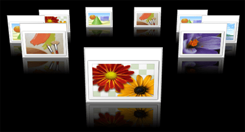
The Carousel view has become a pretty popular visualization for a list of items. It consists of a set of items arranged circularly with the selected item brought to the front, just the like the figure below:

In a recent discussion on the WPF Disciples Group, I got a little motivated to experiment with this view for ElementFlow. After frying a few of my grey cells I finally got something that looked like a carousel.
Here is a quick video that shows this in action.
This is not yet perfect
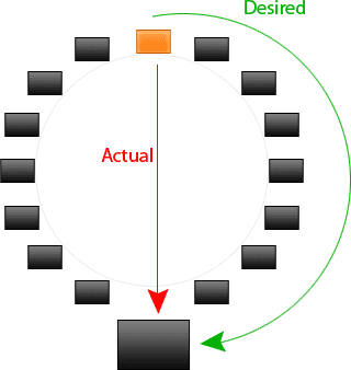
The behavior of this view becomes a little hard to understand when you select an item at the back. The selected item doesn’t rotate into the focused position but rather does a translation. The desired behavior should be like the green marking in the figure below:

To achieve that I need to make some structural changes to the way the animations are created for the Views. Right now there is a common animation that is used for all the views. What we need is a way for the view to specify its desired animation (Storyboard). Most views will use a default Storyboard from ViewStateBase but special cases like the Carousel view will furnish its own Storyboard. I am going to think through this a little bit more and post an update later.
