The iPhone (-like) interface in WPF
Sometime back I had worked on an internal Instant Messaging client for our company. We were looking for some inspiration for our client interface and at about the same time the iPhone****was introduced. After a lot of thought (which was like “few minutes”), we decided to mimic the iPhone interface for our client.
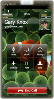
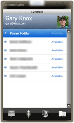
The enabling UI technology was Windows Presentation Foundation (WPF). With WPF we could rapidly build something that looks a lot like iPhone in a very short time. I was playing the dual role of a Designer + Developer and tools like Blend and Designgreatly helped in skinning the app. Below you can see a bunch of screenshots and a short video of accepting a call.
Notification received. You can talk, IM or just ignore.

In an audio chat (call)

Contact list

Video of accepting a notification (via Talk)
How was it built?
- Blend and Design were used for creating the skin of the app. The XAML UI was created in Blend and the graphics were developed in Design. I had made a post earlier about how the icons for the app were created in Design.
- The GlassWindow control was used for creating the window chrome.
- Although you cannot see in the screenshots above, the Drag ‘n’ Drop library was also used
- I missed out using the ElementFlow, but that can be easily added. I only need to find a business case for that ;)
This example only goes to show how powerful WPF can be. With greater tool support from Blend + Design, lot can be achieved in a far lesser time. Now until I get my own iPhone, I will continue to use the WPF version ;)
