

The Common Patterns of React
The React framework has been used by a wide variety of teams and several folks have written about their own experiences using React. This post compiles a list of the various design patterns that have been observed while building React Components.
React itself allows you to shape the Component Tree the way you want, but certain recurring patterns have made this an easier and more manageable task. The overarching principles are around:
- Separation of concerns between components
- Uni-directional data flow
- Crisp communication via callbacks.
The Patterns
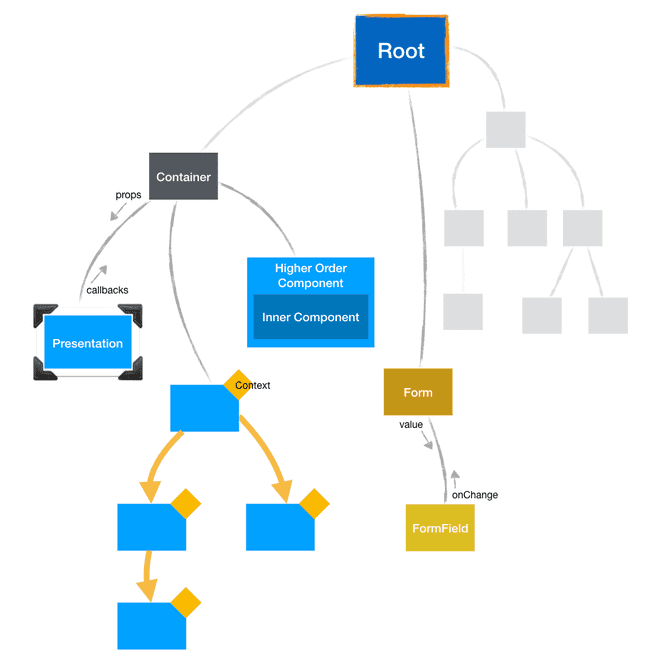
Higher Order Components
Just like higher-order-functions, where you create a decorator function to encapsulate a responsibility, Higher Order Components (HOC) do the same thing where you provide a cross-cutting behavior and infuse it into the decorated component.
Typically, the HOC is just a function that takes in a Component class as its primary input. It decorates the passed in Component and gives back a new Component (the Higher Order Component) that contains the new behavior. The HOC also takes on the responsibility of invoking the inner Component at the right time and passing in any additional props.
// higher-order-component.js
function HigherOrderComponent(InnerComponent) {
    // Give back a wrapped Component
    return class WrappedInnerComponent extends React.Component {
        render() {
            const shouldRender = this.applySomeLogic();

            // Render conditionally
            return shouldRender ? <InnerComponent {...this.props} /> : null;
        }
    };
}
With this approach, the HOC is more like a Container Component, with the inner component being the Presentation counterpart. Of late, there is some consensus brewing that a HOC may not even be needed in most cases!
I have a separate post specifically targeted at Higher Order Components
Although it is still a prevalent style of thinking for encapsulating behavior, a similar result can be achieved with the idea of Function as Child Component. Read on…
Function as Child Component
Every React component receives a special prop called the children. This can be anything that is enclosed within the start tag and end tag in JSX, something like:
// special-component.js
export function SpecialComponent({children}) {
    // Use the children here. Can be anything the component needs
}

// Somewhere else in your app
<SpecialComponent>
    { // anything goes here ... // }
</SpecialComponent>
Most often we are used to seeing React Elements inside those tags…
<SpecialComponent>
    <Message text="Hello World" />
</SpecialComponent>
…but technically anything is possible, including a function!
<SpecialComponent>
    {// This can be a function too!
    () => {}}
</SpecialComponent>
Having a function as the only child gives a similar ability like the HOC, where the encapsulating Component takes over the responsibility of invoking the child-function at the right time. The function can be invoked with specific arguments (aka props) that can be used to control the behavior.
If you think about it, you will realize that this is like a Presentation Component which is rendering purely based on its arguments.
<Router render={(props) => <div>I get rendered<?div>}/>
— Ryan Florence (@ryanflorence) March 16, 2017
<Motion>{(styles) => ()}</Motion>
render() { return this.props.children(state) }
Ryan Florence from React Training has called this the Render Props, which is pretty close to the notion of a disguised Presentation Component ;-)
This technique was first observed in the react-motion library for sending animated values to the rendered component, like so:
import { Spring } from 'react-motion';
export function AnimatedDiv() {
return (
<Spring defaultValue={0} endValue={100}>
// Aha: Function as child is perfect to pass in the animated value!
{value => {
return <div style={{ transform: `translateX(${value}px)` }} />;
}}
</Spring>
);
}
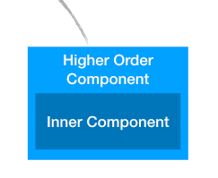
// ...React Context for data propagation
The context is a special storage that is available on the React Component Tree. It allows passing some shared props down a component sub-tree without having to manually pass it at every level. The use cases for this are pretty limited and most often you don’t need this. In fact the React Team strictly advises NOT to use it. It is always possible to do the same using a HOC or a Function-As-Child component pattern.
If you still feel this pattern is needed, check out the React Docs.
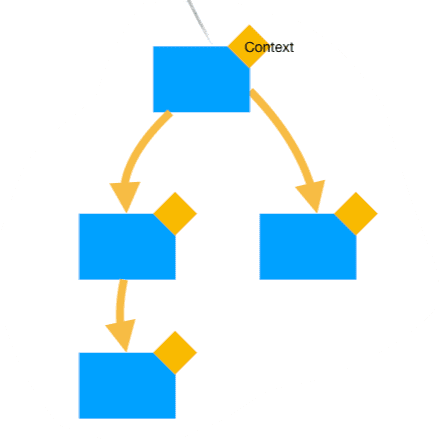
Notification callbacks
In the visual tree of React Components, its mostly the leaf or lower level components that handle direct user input. Of course, this component is not responsible for responding to the user input but instead notifies someone higher up that a user event happened. This notification is usually done one level up, to the parent or at most 2 levels to the grand parent. The notification is done via a callback function that is passed as prop from the ancestor.
This pattern is the de facto way of communication for Form inputs. In React parlance, they are controlled inputs. The form inputs receive the value and an onChange callback. These input-components never mutate the value; its always specified by the higher level component. Any user driven change is notified via the onChange callback. This kind of coupling makes the input a pure presentation component. Also worth noting here is that it enforces the uni-directional data flow.
Data always trickles down from the top, while events flow up.
function SimpleForm({entity, fieldName, onFieldChange}) {
    const value = entity[fieldName];

    return (
        <form>
            // Value in ⬇, onChange out ⬆
            <input value={value} onChange={onFieldChange}>
        </form>
    );
}
Delegation for passing multiple callbacks
When there are multiple notifications possible from the leaf level components, its better to encapsulate them into a delegate object. The prop that is passed down from the ancestor is an object that contains the named callbacks.
This pattern is very common in the AppKit/UIKit frameworks on macOS and iOS.
render() {
    // Put all the callbacks into a delegate object
    const delegate = {
        onChange: () => {},
        onBlur: () => {},
        onFocus: () => {},
        onDelete: () => {},
    };

    return (
        <div>
            <label>Name</label>
            <FormInput delegate={delegate} />
        </div>
    );
}
Container and Presentation Components
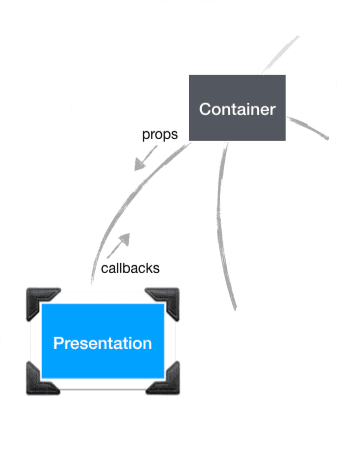
The Container - Presentation pair strikes a nice balance of distributing responsibilities. It usually forms a Parent - Child relationship with very clear contract between the two. The term Container - Presentation has stuck in our jargon, but a more appropriate way to look at this is Producer - Consumer. Let’s see some use cases revolving around this pattern.
| Container (Producer) | Presentation (Consumer) |
|---|---|
| Container fetches data (via stores or straight API calls) | Presentation renders the data |
| Container provides the layout with placeholder | Presentation fills it with content |
| Container handles an application level responsibility like authentication, responsive behavior, routing, analytics | Presentation renders the associated Component. |
In each of the above cases, the Container takes the responsibility of producing the data or performing some activity. The Presentation takes the responsibility of consuming the data in whatever way it sees fit. The consumption could be a render task but it could also be a downstream Container that becomes a producer for other lower level consumers. The important thing to realize is the pairing of these components that neatly separates the responsibilities.
Compound Components
The term Compound refers to the cluster of related components that all help in defining the overall visual structure of the top-level component. If you consider a complex component such as Wizard, it has many sub-parts. When you want to customize these various sub-parts, you have two options:
- You could expose a variety of properties on the
<Wizard />component - You could decompose the
Wizardinto a set of related sub-parts and allow customization directly on the sub-parts.
Option 2. is what we are focused on here. By breaking the top-level <Wizard /> into a set of sub-parts such as <WizardHeader />, <WizardFooter />, <WizardStep />, we expose the composition of Wizard and also allow customization directly on the sub-part. We also avoid conflating properties from multiple sub-parts at the Wizard level. To top it off, we are greatly improving readability.
In code, this is how Option 1. would look: a pile of properties under one <Wizard /> tag:
<Wizard headerTitle="" headerCSS="" headerSubtitle="" footerActions={[]} footerCSS="" footerMessage="" steps={{}} />Contrast this to Option 2., where it exposes the composition and customizations at the right part:
<Wizard>
    <WizardHeader title="" subtitle="" css="" />

    <WizardStep component={Step1Component} />
    <WizardStep component={Step2Component} />
    <WizardStep component={Step3Component} />

    <WizardFooter actions={[]} message="" css="" />
</Wizard>
When refactoring towards Compound Components:
- Look out for components that have accumulated a lot of properties. These are the monoliths you want to break up
- Identify the sub-parts that are contributing to these properties
- Break it down into sub-Components, moving all related properties together
- Profit!
Summary
I am sure there are many more interesting patterns of interplay between React Components. Many of them are grounded around the principles of Object Oriented Programming, SOLID, Functional Programming. With the React Component being the atomic unit, its how we compose larger structures, using techniques that help us scale large applications.