A DoubleBorderDecorator to simplify rounded-border decorations
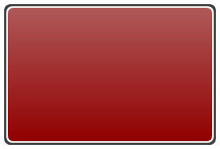
The designers in my team use a lot of nested double-Border elements to achieve a nice rounded border-effect around containers. In XAML this looks like so:
<Border Background="#FF414141"
        Padding="3"
        Width="300"
        Height="200"
        CornerRadius="8">
    <Border Padding="3"
            CornerRadius="8">
        <Border.Background>
            <LinearGradientBrush EndPoint="0.5,1"
                                 StartPoint="0.5,0">
                <GradientStop Color="#FF910000"
                              Offset="1" />
                <GradientStop Color="#FFAF5959" />
            </LinearGradientBrush>
        </Border.Background>
    </Border>
</Border>
You will notice that there is no use of the BorderThickness and
BorderBrush properties. Instead this effect achieved by nesting one
Border inside another using the Background property and setting a
Padding on the outer-Border. The reason why they do this is because of
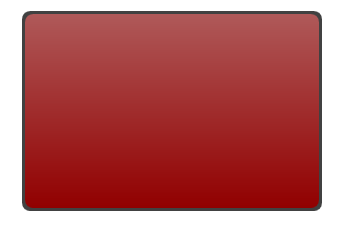
a rendering glitch in WPF’s Border element. If you try to create the
above look using a single Border with BorderThickness, BorderBrush and
Background, you will see the corners having some glitches. The image
below (zoomed to 150%) shows this clearly. Notice the white inner-curve
around the corners and compare this to the image above. Clearly there is
a glitch here.
Here’s the single-Border XAML that was used for the above look:
<Border BorderBrush="#FF414141"
        CornerRadius="8"
        Margin="137,111,193,137"
        BorderThickness="3">
    <Border.Background>
        <LinearGradientBrush EndPoint="0.5,1"
                             StartPoint="0.5,0">
            <GradientStop Color="#FF910000"
                          Offset="1" />
            <GradientStop Color="#FFAF5959" />
        </LinearGradientBrush>
    </Border.Background>
</Border>
So, now you know why the nested double-Border technique is so effective and creates a much more pleasing look. But, we have a problem here. If your project is large and using several different kinds of containers with the rounded–border effect, you will be using a LOT of these Borders! It also hampers the readability at some point. Surely there can be a better way…in the form of a custom DoubleBorderDecorator!
DoubleBorderDecorator
This is a simple Decorator derived class that I created which bakes in
the above discussed technique with simple configurable properties. To
achieve the effect from our previous example, here is the XAML using the
DoubleBorderDecorator:
<shared:DoubleBorderDecorator Height="200"
                              Width="300"
                              OuterBorderThickness="3"
                              OuterBorderBrush="#FF414141"
                              CornerRadius="8"
                              Background="{DynamicResource RedGradient}" />
Visually it looks exactly like our first figure, but lot simpler to use and modify. In fact, you can even define a Style and set the defaults at a global level (inside Application Resources).
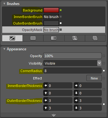
Here is a Blend screenshot that shows other useful properties of this decorator:
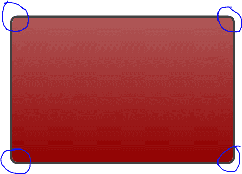
With an inner-border and an outer-border, you get a pretty flexible way of creating rounder-border effects that look great. Here are a few examples: