A panel that scrolls about a half-circle
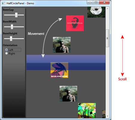
This post is inspired by an interesting idea sent by Bo Stilling, one of the readers of my book. It combines the ideas discussed in Chapter 4 “Custom Panels” and Chapter 7 “IScrollInfo” to create a panel that lays out the items about a half-circle. When you scroll the panel, the items move about a half-circle. I thought that was interesting because generally when you scroll, the items always move vertically up/down. This panel creates a distortion that makes the items move about a circle, as in the following figure:

Before we dive into the details, lets look at a video of the panel in action:
How was it built?
There are two core responsibilities of this panel:
- Layout about the half-circle
- Scrolling
The layout is achieved by using the standard polar equations of a circle. The panel
provides three dependency-properties that allows you to control the size
of the items (ItemWidth, ItemHeight) and the gap between the items
(ItemGap). We use these properties to spread the items about the circle.
The ItemGap property can be used to create a fan-in, fan-out kind of
effect with the items. It is not shown in the video but you can play
with the ItemGap slider to see it in action.
Since the items are supposed to be present about a half-circle we have a
condition that checks the angle of an item against the hard limits –90
and +90 (-Math.PI /2 and +Math.PI/2). Any item whose angle is outside of
this range is reduced to a zero-size Rect. This is just one way of
optimizing the panel. Ideally, we should convert this to a
VirtualizingPanel that removes the UI containers outside this
angle-range. For now, let’s leave it out.
The other responsibility of scrolling is achieved by using a
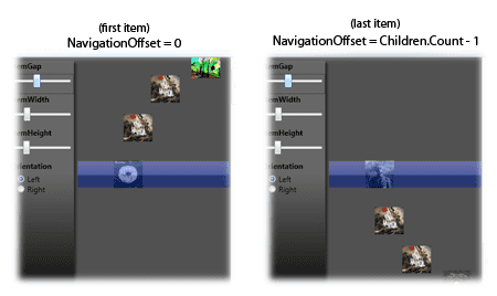
dependency-property called NavigationOffset. The NavigationOffset is a
double value that lies in the inclusive range [0, <# of Children -
1>]. When the NavigationOffset is 0, you are at the first item, which
is located in the center of the panel. When the NavigationOffset is <#
of Children - 1>, you are at the last item, which is again located at the center of the panel.

Thus the NavigationOffset is an interpolated value that lies in the
range [0, # of Children – 1]. This works well with the concept of
scrolling since it is just an interpolation of the thumb between the
Minimum and Maximum values of the ScrollBar. Thus in XAML, we can
directly bind the ScrollBar.Value property to the
HalfCirclePanel.NavigationOffset, as shown below:
<ScrollBar x:Name="Scroller"
           Orientation="Vertical"
           Minimum="0"
           ViewportSize="5"
           Value="0"
           DockPanel.Dock="Right" />

    <CircularPanelTest:HalfCirclePanel x:Name="CircPanel"
                                     NavigationOffset="{Binding Value, ElementName=Scroller, Mode=TwoWay}"
                                     ItemWidth="{Binding Value, ElementName=ItemWidthSlider, Mode=Default}"
                                     ItemHeight="{Binding Value, ElementName=ItemHeightSlider, Mode=Default}"
                                     ItemGap="{Binding Value, ElementName=ItemGapSlider, Mode=Default}"
                                     d:LayoutOverrides="Width"
                                     ClipToBounds="True"/>
There is one more advantage of having a property like NavigationOffset:
animation! In fact that is how I do the snap-in animation in the video
above. I create a Storyboard that animates the NavigationOffset from the
current value to the snap-in value. I have a public method called
AnimateToOffset that does this job.
Source code and download

The HalfCirclePanel has been checked into the FluidKit project. You can download the source from http://fluidkit.codeplex.com/SourceControl/ListDownloadableCommits.aspx.
Once you download, run the FluidKit.Showcase project to see the panel come to life!
Have an interesting idea ?
I had a great time building this Panel over the weekend. Thanks to Bo for sending the idea. If you have any interesting ideas or would like to get suggestions for developing your controls, please do send it my way and I’ll try to come up with a solution that you find useful. Also it is always fun to have a challenge for a weekend ;-)
