Super Fast alternating row colors in a ListBox
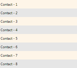
One of the applications we are building required a ListBox control that displayed a bunch of contacts. We also wanted to make the rows in the ListBox have alternating row colors, just like the figure below:

Our first guess was to use an ItemTemplateSelector. Inside the selector we would check the index of the item and furnish the appropriate DataTemplate. But this required duplication of the DataTemplate and unnecessarily cluttered the ResourceDictionary. There had to be a simpler way.
After some brain-storming with David (my team mate) we figured out a better way. The idea was to use a tiled DrawingBrush.
A tiled DrawingBrush
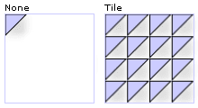
Each row in our ListBox was having a fixed Heightof 30. We decided to leverage that fact while building the DrawingBrush. To understand the technique lets get a quick refresher on the way a TileBrush works with its TileMode = “Tile”. Here is a simple DrawingBrush (taken from MSDN Docs) and the result of painting a Rectangle with TileMode = “Tile”

If you look at our ListBox above, the graphic we want to tile should look like so:

In XAML, this would translate to:
<DrawingBrush Viewbox="0,0,10,60"
              ViewboxUnits="Absolute"
              TileMode="Tile"
              Viewport="0,0,10,60"
              ViewportUnits="Absolute">
    <DrawingBrush.Drawing>
        <DrawingGroup>
            <GeometryDrawing Brush="#19f39611">
                <GeometryDrawing.Geometry>
                    <RectangleGeometry RadiusX="0"
                                       RadiusY="0"
                                       Rect="0,0,10,30"/>
                </GeometryDrawing.Geometry>
            </GeometryDrawing>

            <GeometryDrawing Brush="#19000000">
                <GeometryDrawing.Geometry>
                    <RectangleGeometry RadiusX="0"
                                       RadiusY="0"
                                       Rect="0,30,10,30"/>
                </GeometryDrawing.Geometry>
            </GeometryDrawing>
        </DrawingGroup>
    </DrawingBrush.Drawing>
</DrawingBrush>
Note the properties ViewBox, ViewBoxUnits, Viewport and ViewportUnits. Essentially the DrawingBrush consists of two Rectangles of Height=30 placed one over other.
Using it with ListBox
Here is the XAML for the ListBox with the alternating background. You can paste it directly into XamlPad or Kaxaml. It works just as you expect, scrolls well and is super-fast ;).
<Page
    xmlns="http://schemas.microsoft.com/winfx/2006/xaml/presentation"
    xmlns:x="http://schemas.microsoft.com/winfx/2006/xaml">
    <Page.Resources>
        <DrawingBrush x:Key="AlternatingRowBackground"
                      Viewbox="0,0,10,60"
                      ViewboxUnits="Absolute"
                      TileMode="Tile"
                      Viewport="0,0,10,60"
                      ViewportUnits="Absolute">
            <DrawingBrush.Drawing>
                <DrawingGroup>
                    <GeometryDrawing Brush="#19f39611">
                        <GeometryDrawing.Geometry>
                            <RectangleGeometry RadiusX="0"
                                               RadiusY="0"
                                               Rect="0,0,10,30"/>
                        </GeometryDrawing.Geometry>
                    </GeometryDrawing>

                    <GeometryDrawing Brush="#19000000">
                        <GeometryDrawing.Geometry>
                            <RectangleGeometry RadiusX="0"
                                               RadiusY="0"
                                               Rect="0,30,10,30"/>
                        </GeometryDrawing.Geometry>
                    </GeometryDrawing>
                </DrawingGroup>
            </DrawingBrush.Drawing>
        </DrawingBrush>

        <ControlTemplate x:Key="ICTemplate">
            <ScrollViewer>
                <Grid Background="{StaticResource AlternatingRowBackground}">
                    <ItemsPresenter/>
                </Grid>

            </ScrollViewer>
        </ControlTemplate>
    </Page.Resources>
    <Grid>

        <ListBox Template="{StaticResource ICTemplate}">
            <Grid Height="30">
                <TextBlock Text="Contact - 1"
                           VerticalAlignment="Center"/>
            </Grid>
            <Grid Height="30">
                <TextBlock Text="Contact - 2"
                           VerticalAlignment="Center"/>
            </Grid>
            <Grid Height="30">
                <TextBlock Text="Contact - 3"
                           VerticalAlignment="Center"/>
            </Grid>
            <Grid Height="30">
                <TextBlock Text="Contact - 4"
                           VerticalAlignment="Center"/>
            </Grid>
            <Grid Height="30">
                <TextBlock Text="Contact - 5"
                           VerticalAlignment="Center"/>
            </Grid>
            <Grid Height="30">
                <TextBlock Text="Contact - 6"
                           VerticalAlignment="Center"/>
            </Grid>
            <Grid Height="30">
                <TextBlock Text="Contact - 7"
                           VerticalAlignment="Center"/>
            </Grid>
            <Grid Height="30">
                <TextBlock Text="Contact - 8"
                           VerticalAlignment="Center"/>
            </Grid>
        </ListBox>
    </Grid>
</Page>
[Update, 2/11/08]
There are couple advantages of this technique.
- You don’t have to recalculate the row color when you add or delete rows. This is a major problem with the ItemTemplateSelector technique and can cause a performance bottleneck.
- You can easily swap a different DrawingBrush and make it customizable (skinnable).
One caveatof this technique is that the row-height of the ListBox should be fixed. It may be possible to bind the heights of the Rectangles in the DrawingBrush to the height of the ListBoxItem (thanks David for the idea), but I haven’t looked into it.
Hope you find it useful.
