

SlideDeckPanel - panel that does Card Deck layout
In one of my recent explorations in a project I had to implement a panel layout that displayed its items as cards that have been fanned out right->left.
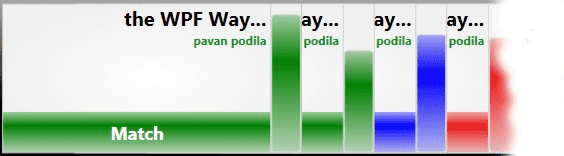
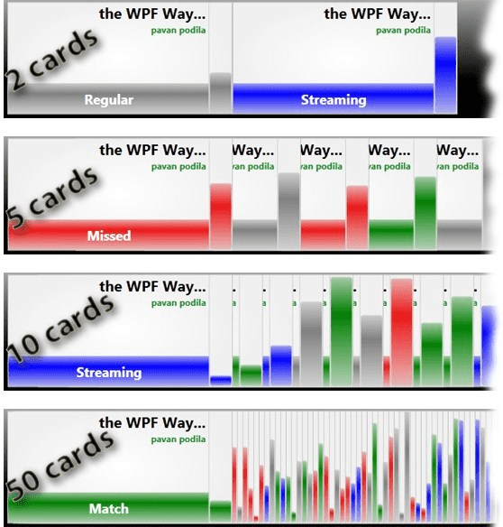
Effectively the cards are laid out right-to-left, with the card on the right overlaying on the previous one. If the panel has enough space to accommodate all cards, there would be no overlap. As we keep increasing the number of cards, the amount of overlap increases appropriately.
Selections and Hovers
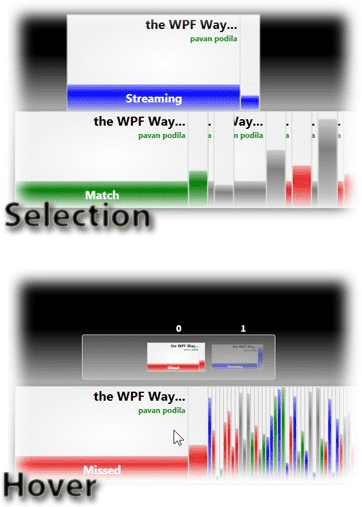
Selections and Hovers are an integral part of interacting with a list of items. There are some default selection and hover behaviors that are associated with this layout. However we wanted to make it customizable from the component point-of-view. Thus it is possible for an user of this panel to provide custom animations for selection and de-selection. On the same note, it is also possible to create custom adorners for hovers. The selection + hover logic has been abstracted enough to keep things very simple. The programmer only needs to provide Storyboards for animating the selection/deselections. As regards the adorners for hovers, the panel only needs a ControlTemplate (with standard names for placeholders).
Using these ideas it is also possible to change the selection and hover animations on the fly. The following video demonstrates these concepts. I use two kinds of selections (None, JumpSelection) and two kinds of hovers.
In a future post I’ll go over some details about how you can implement such dynamic custom controls/panels.