

Reusing decorative panels with ContentControl + ControlTemplate
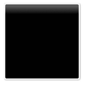
Of late I found a new use for ContentControl, which is to use it as a decorator (note the small-case ‘d’). Lets take an example to illustrate this idea. Imagine you want to use a panel decoration like the one below:
There are couple of ways in which this can be achieved.
- Build the Visual tree of the decoration around every control that needs to be decorated — too much duplication if it needs to be reused at lot of places
- Create a custom Decorator and override the OnRender() method — too tedious to modify the visual aspects (colors, gradients, bitmap-effects, etc) since we are building the decoration in code
- Make the visual tree as a ControlTemplate and use it for a ContentControl. The child of the ContentControl will be the control you want to decorate.
The last option is the most interesting one. Lets reproduce the XAML used to build the decoration above.
<Grid>
    <Border Background="#FFFFFFFF"
            BorderBrush="{StaticResource PanelBorderBrush}"
            BorderThickness="1,1,1,1"
            CornerRadius="5,5,5,5">
        <Border Margin="3,3,3,3"
                Background="#FF000000"
                BorderBrush="{StaticResource PanelBorderBrush}"
                BorderThickness="1,1,1,1"
                CornerRadius="5,5,5,5">
        </Border>
    </Border>
    <Rectangle Stroke="{x:Null}"
               VerticalAlignment="Top"
               Height="54">
        <Rectangle.Fill>
            <LinearGradientBrush EndPoint="0.5,0.815"
                                 StartPoint="0.5,0.241">
                <GradientStop Color="#57FFFFFF"
                              Offset="0" />
                <GradientStop Color="#00FFFFFF"
                              Offset="1" />
            </LinearGradientBrush>
        </Rectangle.Fill>
    </Rectangle>
    <Grid.BitmapEffect>
        <DropShadowBitmapEffect Color="Black"
                                Direction="315"
                                ShadowDepth="1"
                                Softness="0.5"
                                Opacity="0.5" />
    </Grid.BitmapEffect>
</Grid>
If you had to use this decoration for many controls, you would have to reproduce this visual tree many times, resulting in serious amount of duplication. What we would like to see is a much simpler way of adding decoration (similar in principle to Decorator), something like so:
<ContentControl Template="{StaticResource BlackPanelBorderTemplate}"
                Grid.Row="3"
                Grid.ColumnSpan="2"
                Margin="10,10,10,10">
    <views:StatusInfo />
</ContentControl>
What we are doing here is abstracting the visual decoration into a ControlTemplate and then using the ContentControl as a Decorator !! This makes the markup more readable and maintainable. If you have to make any changes to the decoration, it happens inside the ControlTemplate and automatically updates all the places where it is referred. As a developer, that is exactly what I want — central point of control. Note that this sounds like the Single Responsibility Principle (SRP).
The ControlTemplate looks as below. Note the use of the <ContentPresenter/>, which will hold the child content.
<ControlTemplate x:Key="BlackPanelBorderTemplate"
                 TargetType="{x:Type ContentControl}">
    <Grid>
        <Border Background="#FFFFFFFF"
                BorderBrush="{StaticResource PanelBorderBrush}"
                BorderThickness="1,1,1,1"
                CornerRadius="5,5,5,5">
            <Border Margin="3,3,3,3"
                    Background="#FF000000"
                    BorderBrush="{StaticResource PanelBorderBrush}"
                    BorderThickness="1,1,1,1"
                    CornerRadius="5,5,5,5">
                <ContentPresenter />
            </Border>
        </Border>
        <Rectangle Stroke="{x:Null}"
                   VerticalAlignment="Top"
                   Height="54">
            <Rectangle.Fill>
                <LinearGradientBrush EndPoint="0.5,0.815"
                                     StartPoint="0.5,0.241">
                    <GradientStop Color="#57FFFFFF"
                                  Offset="0" />
                    <GradientStop Color="#00FFFFFF"
                                  Offset="1" />
                </LinearGradientBrush>
            </Rectangle.Fill>
        </Rectangle>
        <Grid.BitmapEffect>
            <DropShadowBitmapEffect Color="Black"
                                    Direction="315"
                                    ShadowDepth="1"
                                    Softness="0.5"
                                    Opacity="0.5" />
        </Grid.BitmapEffect>
    </Grid>
</ControlTemplate>
I am finding this idea extremely useful and has reduced a lot of XAML for me. So if you looking to create complex decorations alongwith ease of XAML editability (both for the control and the visual-decoration), this may be a good option for you!