

Balloon Text - using Decorators
Recently I had to render some text inside a Balloon, similar to the balloons that you see in Comic Strips. They are also called Speech Balloons.
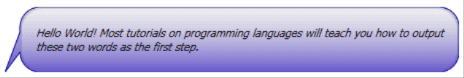
My initial reaction was to use the ScaleNine technique that you have in Adobe Flex. ScaleNine splits the graphic that you see on the left into a grid of 9 tiles, like the TicTacToe grid. As the text grows in length, only the central tiles scale, not the corner tiles. This gives the desired behavior for the balloon. However, using this technique with WPF turns out to be cumbersome. It seemed like introducing a lot of complexity just to get a simple scalable balloon.
Then it struck me that Decorators would be an elegant solution for this problem. We already have decorators like Border, Viewbox, which override the OnRender() method and draw the lines and curves. Creating a similar decorator for the balloon text seemed like a good solution.
The BalloonDecorator
One of the first steps was to extend the Decorator class and override the methods: OnRender(), MeasureOverride() and ArrangeOverride(). Next I defined some DependencyProperties like Background, CornerRadius, BorderThickness, BorderBrush and PointerLength. Here CornerRadius, BorderThickness and PointerLength properties had extra metadata flags: FrameworkPropertyMetadataOptions.AffectsRender | FrameworkPropertyMetadataOptions.AffectsMeasure
In the OnRender()method, I use a StreamGeometry class to create the geometry of the balloon. StreamGeometry is a lightweight alternative to PathGeometry, since I don’t need any of the data-binding and layout capabilities. The balloon is basically a bunch of lines and curves, broken down into segments as shown below:
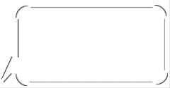
The curvature depends on the CornerRadius property and the PointerLength defines the horizontal length of the Pointer. You can also think of the pointer length as the horizontal gap between the tip of the pointer and the left edge of the rounded rectangle.
In MeasureOverride(), I include the PointerLength, BorderThickness and the dimensions of the rectangle and then return the sum total as the size.
In ArrangeOverride()I need to ensure that my child element is arranged inside the bounds of the balloon. So the child is actually offset by the PointerLength and the BorderThickness. So the arrange-rect for the child is the inner rectangle of the balloon.
Using the BalloonDecorator
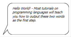
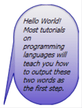
The balloon text in the first figure can be created with the following XAML:
<local:BalloonDecorator PointerLength="20"
CornerRadius="10"
BorderBrush="Black">
<Grid>
<TextBlock Text="Hello World! - Most tutorials on programming ...."
HorizontalAlignment="Center"
FontStyle="Italic"
TextWrapping="Wrap"
TextTrimming="WordEllipsis"/>
</Grid>
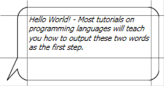
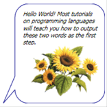
</local:BalloonDecorator>Here are some more examples of the BalloonDecorator in action.
The next steps would be to have some extra customizations on the direction of the pointer and also the appearance. For example I could have a more curvy pointer pointing in the North-East direction!